Design Tokens
What are design tokens?
Design tokens are a way of abstracting and organizing design decisions into a set of reusable, shareable, and consistent values. They serve as the basic building blocks for maintaining design consistency across different platforms, devices, and components within a design system. Design tokens include values such as colors, typography, spacing, and other design properties, providing a common language for designers and developers to use throughout a project.
Why use design tokens?
Design tokens are the smallest, repeatable "design decisions" that make up the visual style of a design system. They replace hard-coded values (like hexadecimal color codes or pixel measurements) with simple, descriptive names. These tokens serve as a single source of truth for both design and development, offering numerous benefits:
-
Consistency: By using design tokens, designers and developers ensure a consistent visual language throughout the user interface. Changes made to design tokens propagate consistently across the entire system.
-
Reusability: Design tokens are reusable values that can be applied consistently across different components, screens, and platforms. This promotes efficiency and helps avoid duplication of effort.
-
Adaptability: Design tokens allow for easy adaptation to different platforms and devices. The same design token values can be used across web, mobile, and other interfaces, ensuring a cohesive user experience.
-
Collaboration: Design tokens facilitate collaboration between designers and developers by providing a shared vocabulary. Both teams can refer to the same set of values, reducing the risk of misinterpretation or inconsistency.
-
Scalability: As projects grow and evolve, design tokens enable scalability. When new components or features are introduced, existing design token values can be leveraged to maintain a cohesive design language.
-
Abstraction: Design tokens abstract design decisions into discrete, manageable units. They break down visual properties, such as colors or spacing, into defined values.
-
Maintenance: Changes to design elements, such as color updates or typography adjustments, can be easily managed through design tokens. This simplifies the maintenance process and helps keep the design system up-to-date.
-
Versioning: Design tokens often incorporate versioning to track changes over time. This allows teams to manage updates, rollbacks, and ensure compatibility across different versions of a design system.
Where tokens live?
Our design tokens are managed in a centralized, platform-agnostic source of truth to ensure consistency across design and development.
You can find them in this Github Repository.
They are defined in JSON files and version-controlled.
Example: data/tokens/00-global/00-base.json
How to find which tokens are applied to a component?
On Figma, you can inspect any component and check the applied styles. These styles are usually linked to design tokens.
While using Figma's Dev Mode, in the right sidebar, using the "Inspect" tab, under the "Code" section, you will find a list of styles applied to the component.
Each style will have a token name associated with it, allowing you to identify which design tokens are being used for that specific component.
Check the video below for a quick demo of how to do this:
Token Categories
Color
Color tokens represent specific colors used in a design system. They include primary, secondary, and accent colors, each defined by a specific value such as a hex code or RGB value.
Usage examples
.component {
  background-color: var(--component-background-colour);
  color: var(--component-text-colour);
}
component: {
  backgroundColor: tokens.ComponentBackgroundColour;
  color: tokens.ComponentTextColour;
}
Border
Border tokens include properties such as border widths, styles, and colors. They establish a consistent look for borders around components or elements.
Usage examples
.component {
  border: var(--component-selected-border);
}
component: {
  ...tokens.ComponentSelectedBorder
}
Border Radius
Border radius tokens define consistent values for the rounded corners of elements in a design system. They provide a standardized set of radii that can be applied to various components, ensuring a cohesive and harmonious appearance across the user interface.
Semantic Tokens
| Prefix | Type | Scope | Role | Intent | Density | State | Description |
|---|---|---|---|---|---|---|---|
| sm (semantic) | border-radius | indicator | Radius for delicate signposting and indicator UIs | ||||
| default | Default radius for all containers | ||||||
| floating | Border Radius for overlaying surfaces that require more breathing space | ||||||
| full | Added radius to emphasise a container | ||||||
| squared | For squared-corner containers |
Default
sm.border-radius.default
Default radius for all containers
Emphasis
sm.border-radius.emphasis
Added radius to emphasise a container
Floating
sm.border-radius.floating
Border Radius for overlaying surfaces that require more roundness
Indicator
sm.border-radius.indicator
Radius for delicate signposting and indicator UIs
Squared
sm.border-radius.squared
For squared-corner containers
Usage examples
.component {
  border-radius: var(--component-border-radius);
}
component: {
  ...tokens.ComponentBorderRadius
}
Typography
Typography tokens encompass font-related values, including font families, sizes, weights, and line heights. These tokens provide consistency in text styles throughout the design system.
Usage examples
.component {
  font: var(--component-title-typograghy);
  text-decoration-line: var(--component-title-typograghy-text-decoration-line);
  text-transform: var(--component-title-typograghy-text-transform);
  letter-spacing: var(--component-title-typograghy-letter-spacing);
}
component: {
  ...tokens.ComponentTitleTypograghy
}
Opacity
Opacity tokens define consistent transparency values that can be applied to elements in a design system. These tokens help maintain a uniform level of transparency across various components, ensuring a cohesive and visually pleasing user interface.
Usage examples
.component {
  opacity: var(--component-disabled-opacity);
}
component: {
  opacity: tokens.ComponentDisabledOpacity;
}
Spacing
Spacing tokens represent the amount of space between elements.
Usage examples
.component {
  gap: var(--component-horizontal-gap);
}
component: {
  ...tokens.ComponentHorizontalGap
}
Sizing
Sizing tokens are a type of design token that specifically controls the dimensions of UI elements. While spacing tokens manage the space between elements (margins, padding), sizing tokens define the actual size of an element itself.
Usage examples
.component {
  width: var(--component-icon-sizing);
  height: var(--component-icon-sizing);
}
component: {
  width: tokens.ComponentIconSizing,
  height: tokens.ComponentIconSizing
}
Shadow
Shadow tokens define box shadow properties, specifying the visual elevation or depth of UI components. They maintain a consistent shadow style across the design system.
Usage examples
.component {
  filter: var(--component-drop-shadow);
}
component: {
  opacity: tokens.ComponentShadow.shadowOpacity,
  radius: tokens.ComponentShadow.shadowRadius,
  offset: [tokens.ComponentShadow.shadowOffset.width, tokens.ComponentShadow.shadowOffset.height]
}
Direction
Direction tokens define consistent values for flex-direction, specifying the direction of the flexible items. This enable us to have different directions by brand, for instante Runner Name → Bet Buttons for one brand and Bet Buttons → Runner Name for other brand.
Usage examples
.component {
  flex-direction: var(--component-flex-direction);
}
component: {
  flexDirection: tokens.ComponentFlexDirection;
}
Token Structure
As discussed earlier, design tokens represent design decisions as data.
There are three types of design decisions for which design tokens are used. They build on top of one another:
Whatdesign options are available to use?Howare those styles applied across the user interface?Whereexactly are those styles applied (in which components)?
There are various names for these three types of tokens (as usual, naming is the hard part). Although technically you can name a token whatever you want, we decided to go with these three names:
Global - define what design options are available
Global tokens (aka called by the community primitive, base, core, foundation or reference tokens) define things like colours, spacing/sizing scales or font families. Some of them could not be used, but they are options to be used. In order to identify them better, we prefix all of ours global tokens with gb. Examples: gb.font-family.font-primary: Arial, gb.colours.yellow.5: #FFF9E2 or gb.sizing.2: 2.
Semantic - define how styles are applied
Semantic tokens (aka called by the community decision, alias or system tokens) will give meaning to a global token. For instance: gb.colours.yellow.5 global token is linked to sm.primary-color semantic token. In order to identify them better, we prefix all of ours semantic tokens with sm. Examples: sm.colours.background.static.neutral.base: "{gb.colours.grey.10}" or sm.border-radius.small: "{gb.border-radius.2}".
Component - define where styles are applied
Component tokens are usually optional on the community, but we decided to use them since they are useful to allow that extra mile of freedom to design, as every component will gain independence (when needed) from the semantic tokens. Ex: sm.primary-color semantic token is linked to primary-button.background.colour. Examples: primary-button-border-radius: "{sm.border-radius.medium}" or primary-button-background-colour: "{sm.colours.surface.interactive.primary.base.active}".
In order to make our token structure multi brand, theme, mode or another dimension in the future, we opted to go with a mechanism of define everything that is need to have an agnostic design system on base files and after override everything that is need on specific files by brand, theme or other dimension. This way we can a new theme or brand in couple of minutes and iterate over it.
For instance, image that on global token, Sky brand wants to have a different font-family we can override it on sky.json file updating the token value for it: gb.font-family.font-primary: "Sky Text".
On the component tokens we decided to split them by business areas: core (components that are shared across all business areas), sports, promotions, accounts and games. This way we can align the same way we have them design on figma and enables the dev side to only include on the application the areas that are needed. For instance, the sports application can include only the core and sports tokens.
This mechanism of base + overrides applies to the other dimensions, imagine that inside Sky brand we want to have primary button with different colour for each theme (sports-light, vegas-light, etc.) we could inherit everything from the brand base and redefine only this colour token, for instance on vegas-light update the semantic token for sm.colours.surface.interactive.primary.base.active": "{gb.colours.amber.80}". The same applies for any new dimension that we would like to introduce in the future, like have different tokens by device type (mobile, desktop or watch) or by orientation (left-to-right or right-to-left).
Token Naming Conventions
Consistent and intuitive naming conventions for tokens are crucial to ensure clarity, maintainability, and scalability across design and development teams.
This documentation outlines the naming conventions adopted for design tokens in our system. It aims to provide guidelines that promote uniformity, facilitate collaboration, and make the tokens easily understandable and accessible for all stakeholders. By adhering to these conventions, we can enhance the efficiency of design handoffs, reduce errors, and create a seamless user experience across platforms.
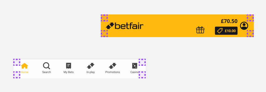
Brand, Themes and Mode Supported
Betfair
- Sports-Dark
- Sports-Light (Default)
Sky
- Bingo-Light
- Casino-Dark
- Sports-Light (Default)
- Vegas-Light
PokerStars
- Sports-Dark (Default)
PaddyPower
- Sports-Light (Default)
- Games-Light
Tooling
Design Tools
- Figma - A collaborative interface design tool used for creating, prototyping, and sharing design assets.
- Tokens Studio for Figma - A plugin that enables design token management directly within Figma, helping maintain consistency and synchronization with development.
Shared
- Github - A platform for version control and collaboration, used to store and manage the design system’s codebase and assets.
- Docusaurus - A documentation framework that helps create and maintain a clear, versioned website for design system guidelines and resources.
Development Tools
- Style Dictionary - A build tool that transforms design tokens into platform-specific styles, ensuring consistent implementation across projects.
- GitHub actions - An automation tool integrated with GitHub to run workflows such as testing, building, and deploying the design system.
- Storybook - A UI component explorer that enables isolated development, testing, and documentation of design system components.
Implementation Flow
Design tokens should always be added/updated/deleted by the design team on figma/tokens studio. Once finalized, these tokens are pushed to our central GitHub repository where they are transformed from a json agnostic structure to specific tech outputs, by Style Dictionary. After this transformation process, the tokens are published and made available for use across all platforms and projects. This collaborative workflow ensures that design tokens remain a single source of truth, always up-to-date, and aligned between design and development.
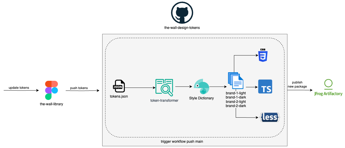
Output Supported
- CSS variables
- TypeScript
- Less variables
Contribution & Governance
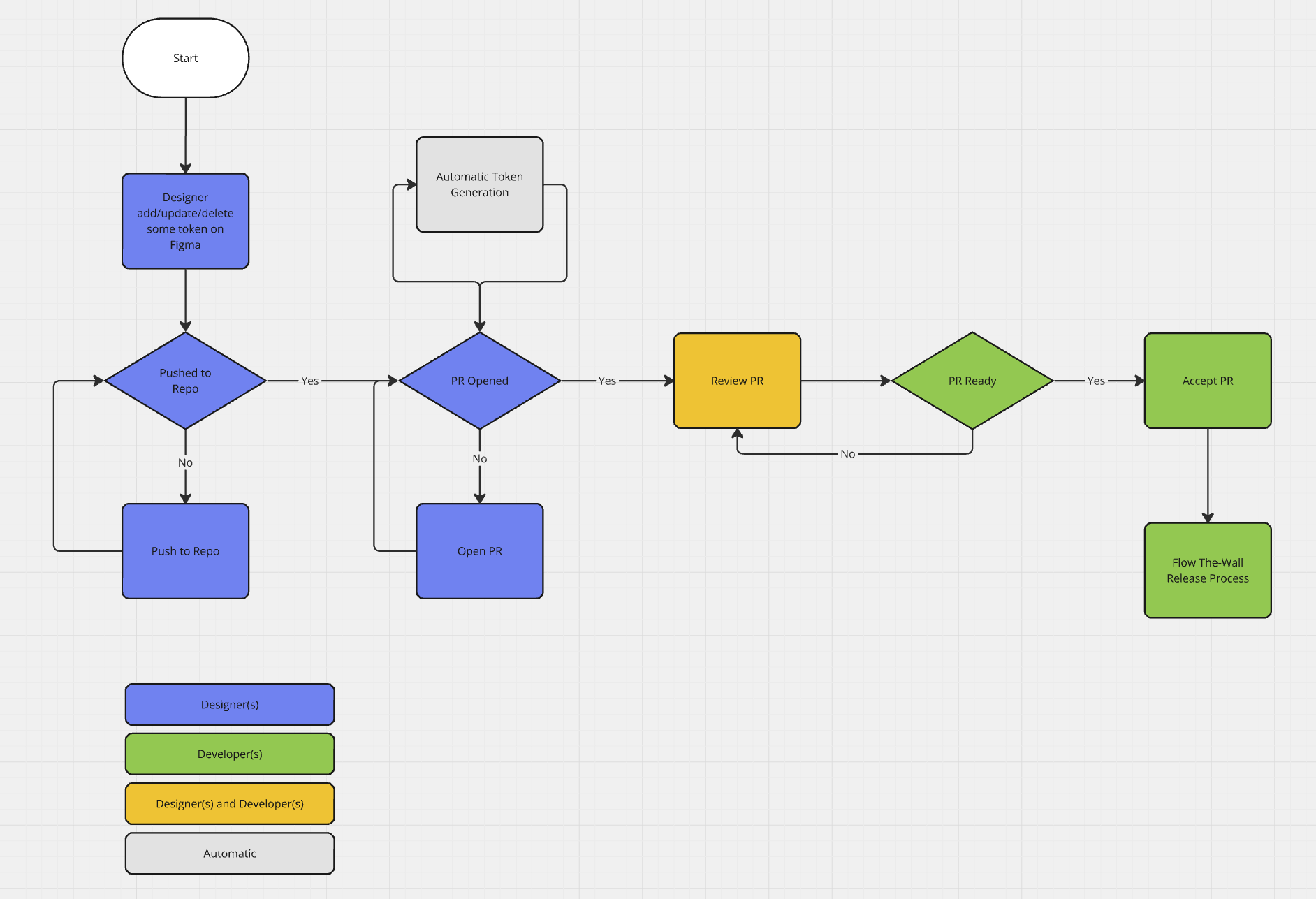
- Designers Add/Update/Delete some token on Figma
- Designers push the change to Github
- Regarding this push, designers should take into account the type of change that they are adding and should add a specific commit message according to that (Conventional Commits). For instance:
- Add a new token - feat: add a new token for Quicklink background
- Update a token - fix: updated token --neutrals-border-elevation2 with new color
- Delete a token - feat: delete the --neutrals-border-elevation2 token BREAKING CHANGE: use instead --neutrals-border-elevation1
- Regarding this push, designers should take into account the type of change that they are adding and should add a specific commit message according to that (Conventional Commits). For instance:
- Designers open a pull request (PR) on Github with the change(s)
- Designers and Developers review the PR
- Developers accept the PR
- An automated release is created based on the commit messages added by designers
- A new NPM packages is created an added to the Artifactory
- Developers check for the new version on the Changelog
- Developers update other projects with the new version
Testing & Validation
To ensure the reliability and consistency of our design tokens and components across all brands and themes, we have implemented a robust testing and validation process. Token generation is fully automated, reducing manual errors and ensuring up-to-date assets are always available.
We also create a dedicated preview environment for every pull request, allowing teams to review changes in context before merging. Additionally, screenshot-based visual regression tests capture and compare UI snapshots for each brand and theme variant. This approach helps us quickly identify unintended visual changes, maintain design integrity, and deliver a seamless user experience across platforms.