Figma Variables — Fixing Skipped Tokens (Border)
Case: Border tokens in TS often combine width + colour (+ sometimes style/dashes/radius) in a single token, so they’re skipped on export. We’ll rebuild the border directly in Figma with variables for width and colour (and optional dash pattern), then bind them to Icon Button.
Goal: Create border Width (Number) and colour (colour) variables in Figma, bind them to the Icon Button’s border, and make them brand/mode/state aware — all without changing Tokens Studio.
Context: Composed border tokens don’t export as variables. For Icon Button, we’ll create Figma variables for border width and border colour, then bind them on the component so brand/mode/state changes ‘just work’.
Step‑by‑step
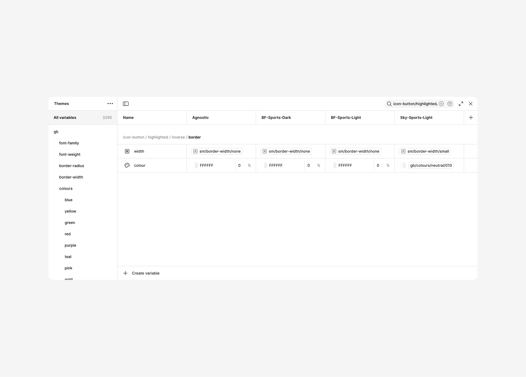
1. Create border variables in Figma
- Open Variables panel (Right sidebar → Local variables).
- Click + Create variable and add:
icon-button/hightlighted/inverse/border/width→ Type: Number → e.g.,sm/border-width/smallicon-button/hightlighted/inverse/border/colour→ Type: colour → e.g.,gb/colours/neutral/010
- (Optional states)
icon-button/border/colour/focus→ colour → e.g., brand primaryicon-button/border/colour/error→ colour → e.g., semantic redicon-button/border/width/focus→ Number → e.g.,sm/border-width/none
- (Optional dashes)
icon-button/border/dash→ Number → e.g.,4icon-button/border/gap→ Number → e.g.,2
- Add modes (Light/Dark or Brand) and provide alternate values for each variable.
Keep names semantic (icon-button/border/*) so they’re easy to discover and reuse.
2. Apply / Bind variables on the Icon Button component
- Select the Icon Button outer container (the frame that visually renders the field outline).
- In the right sidebar, under Stroke:
- Weight → click the variable icon → pick
{icon-button/hightlighted/inverse/border/width} - colour → link to
{icon-button/hightlighted/inverse/border/colour}(from the colour chip’s variable icon) - Position: choose Inside (recommended for crisp corners). (Position isn’t variable-bindable)
- Style: leave Solid (style type isn’t variable-bindable)
- Weight → click the variable icon → pick
- If your Icon Button has circular shape:
- Corner radius can be bound to another variable (e.g.,
{icon-button/radius}) from your Border-Radius flow.
- Corner radius can be bound to another variable (e.g.,
You can also bind corner radius to a variable (from your Border-Radius script) if needed.
3. Optional — Per-side borders
If your design needs different borders per side:
Option A — Per-side strokes (if available on your shape)
- Click the individual sides control for stroke.
- Bind each side’s weight/colour to side-specific variables, e.g.:
icon-button/border/width/top,icon-button/border/colour/top, etc.
Option B — Wrapper layers (universal fallback)
- Nest thin helper rectangles for top/bottom/left/right inside the container (auto-layout works fine).
- Fill each helper with
{icon-button/border/colour}; set height/width to match stroke width (cannot variable-bind size; set via component variant if needed). - Use constraints to pin them to edges.
Prefer per-side strokes when your shape supports it. Use helper layers only when you must.
4. States (focus / error / hover)
- Create variants: Default / Focus / Error / Hover.
- In each variant, re-bind stroke:
- Focus → colour
{icon-button/border/colour/focus}, weight{icon-button/border/width/focus} - Error → colour
{icon-button/border/colour/error}
- Focus → colour
- (Optional focus ring) Add an Effect Style shadow to simulate an outer glow; set shadow colour to a colour variable (e.g.,
focus.ring.colour).
Variants keep your bindings intact and make state visuals predictable.
5. Test brand & mode switching
- Open Variables panel.
- Confirm the Icon Button’s border updates
(colour/width)across variants. - If density modes exist, try smaller/larger
widthvalues per mode.
6. Publish & PR
- Don`t forget to always publish the updated Variables library.
- Also publish the updated Component library.
- If you are already working in a branch, Open a PR with all the token changes and the new exported variables
“When border tokens are skipped on export, create Number and colour variables directly in Figma, bind them to the component’s stroke, and switch states with variants. Brand and mode switches will flow through — no Tokens Studio edits required.